

Allegro / Midnight Rich
iOS / 08 Home
Cover v2
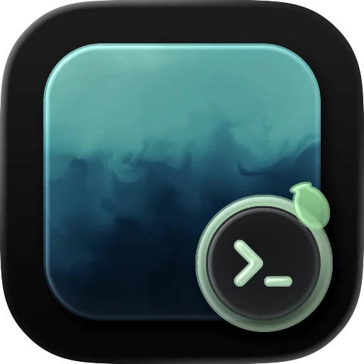
Terminal Lens
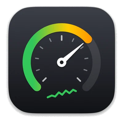
Usage Finder
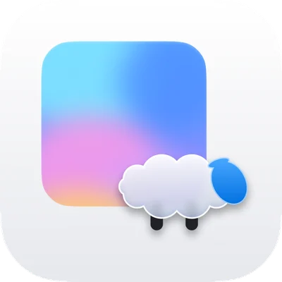
A · Glass Lamb
v1
Budly / Palette
Allegro / Dusk Indigo
AaFraunces
iOS / 01 Welcome
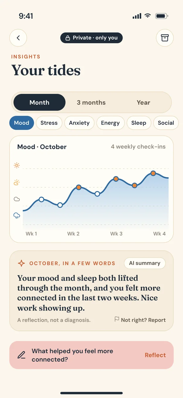
iOS / 18 Journey
Web / D03 Home
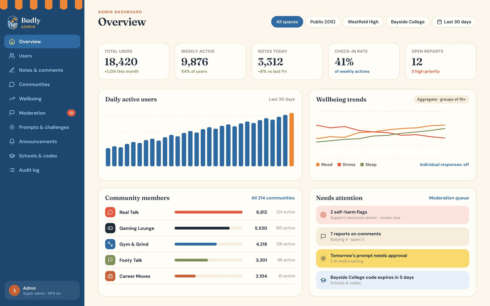
Admin / A01 Overview
00 Design direction
Allegro / Sage Forest
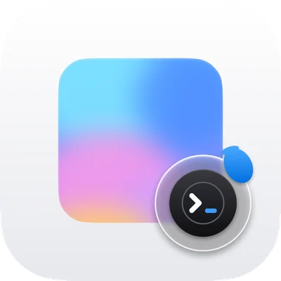
C · Concept

01 / 06Product design · 2026

BudlyiOS and web app
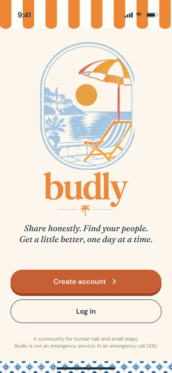
iOS / 01 Welcome
The welcome screen: the Budly logo of a deck chair under a striped umbrella
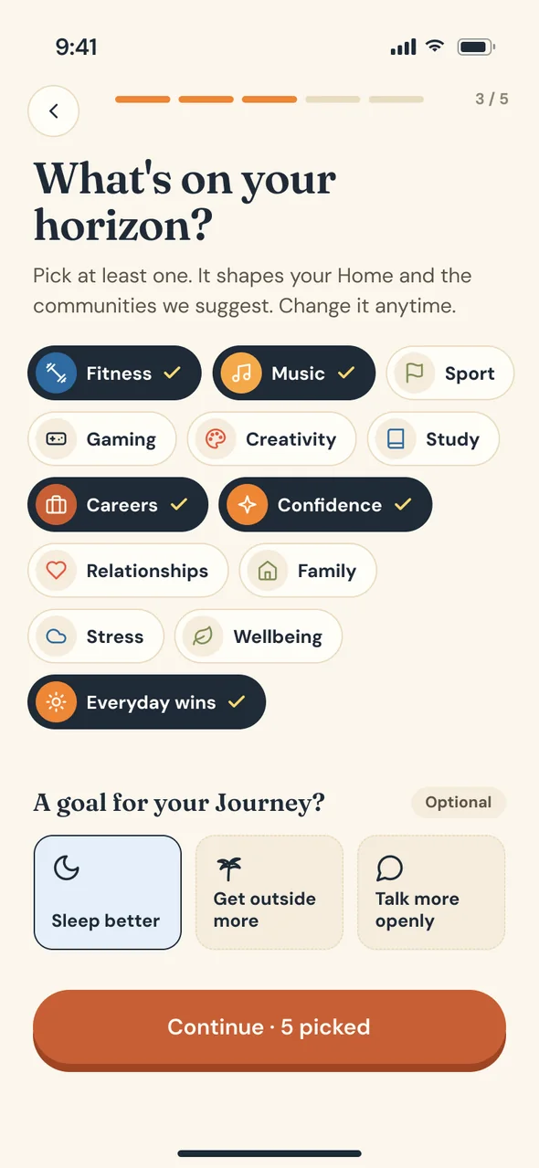
iOS / 05 Interests
Choosing interests as chips during onboarding
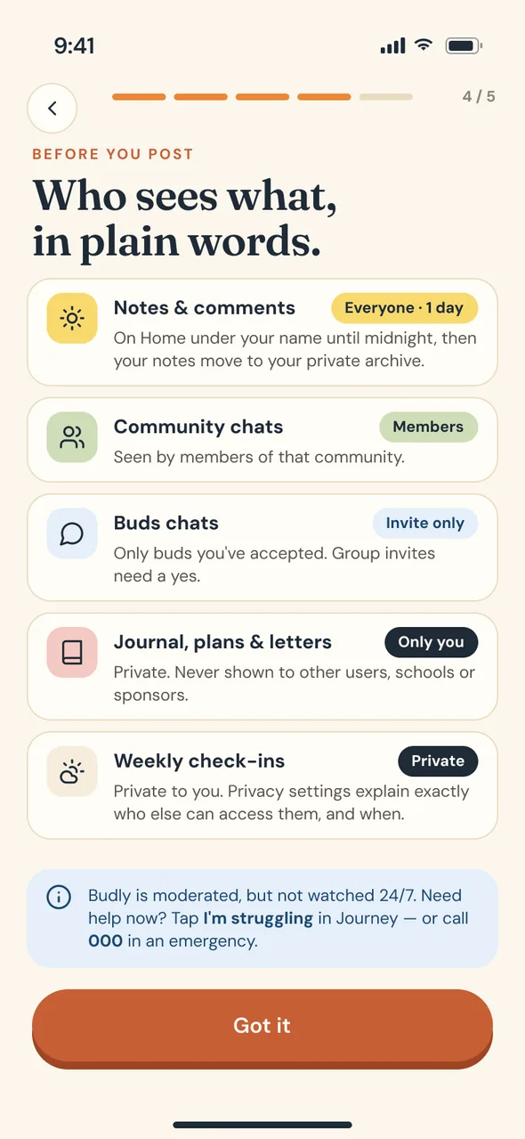
iOS / 06 Who sees what
A plain-words privacy screen listing who sees notes, chats, journal and check-ins
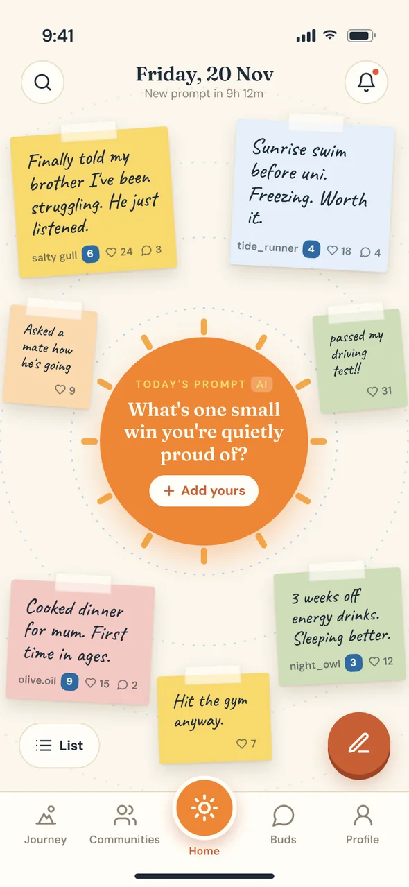
iOS / 08 Home
Home: handwritten sticky notes around the day's prompt, drawn as a sun
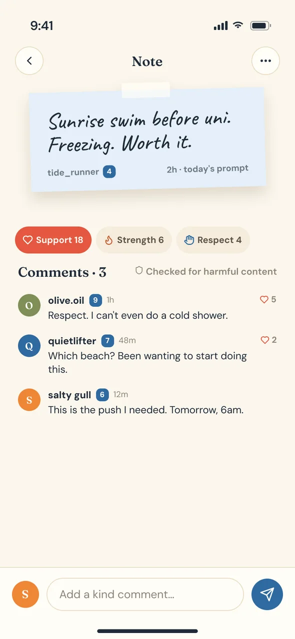
iOS / 10 Note detail
A sticky note opened with its replies
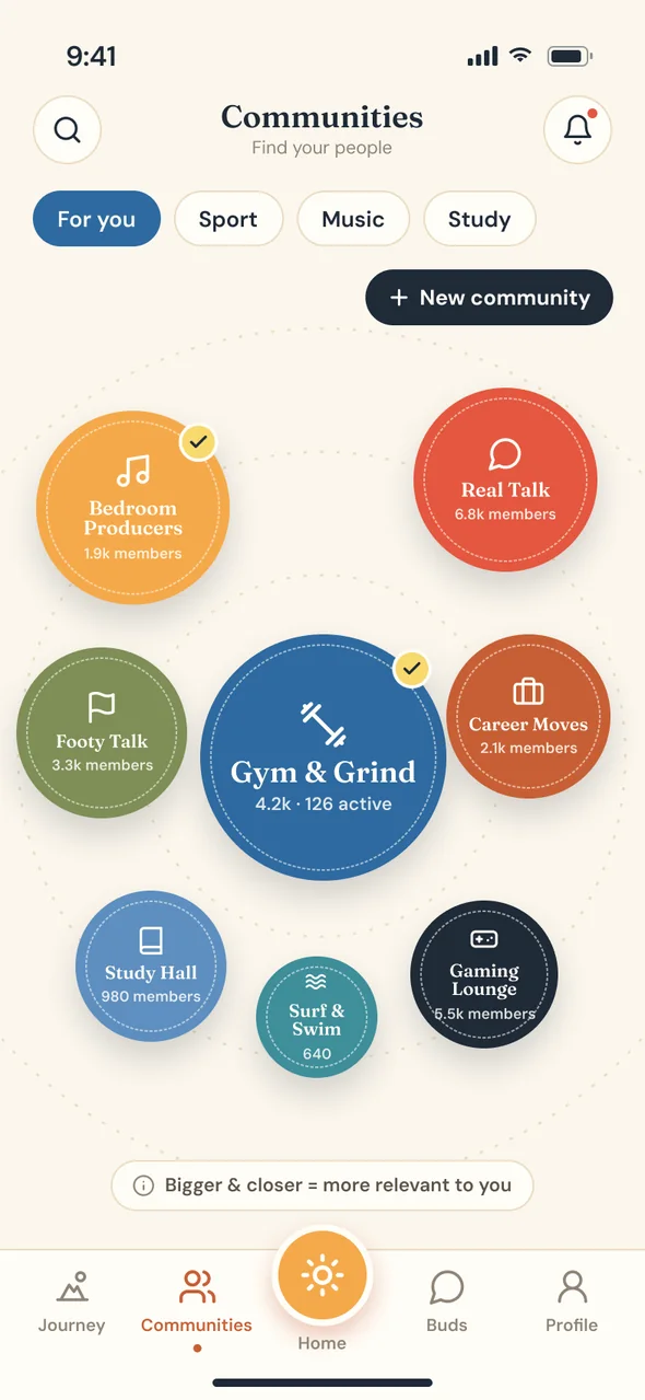
iOS / 14 Communities
Communities as coloured bubbles sized by activity
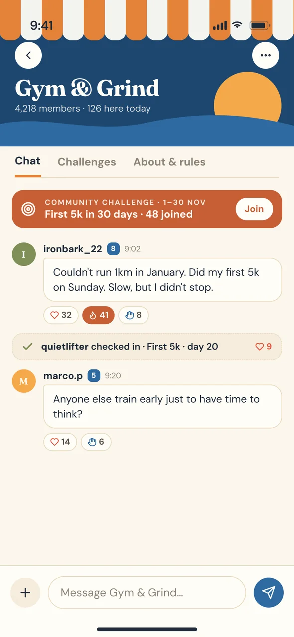
iOS / 16 Community chat
A community's group chat
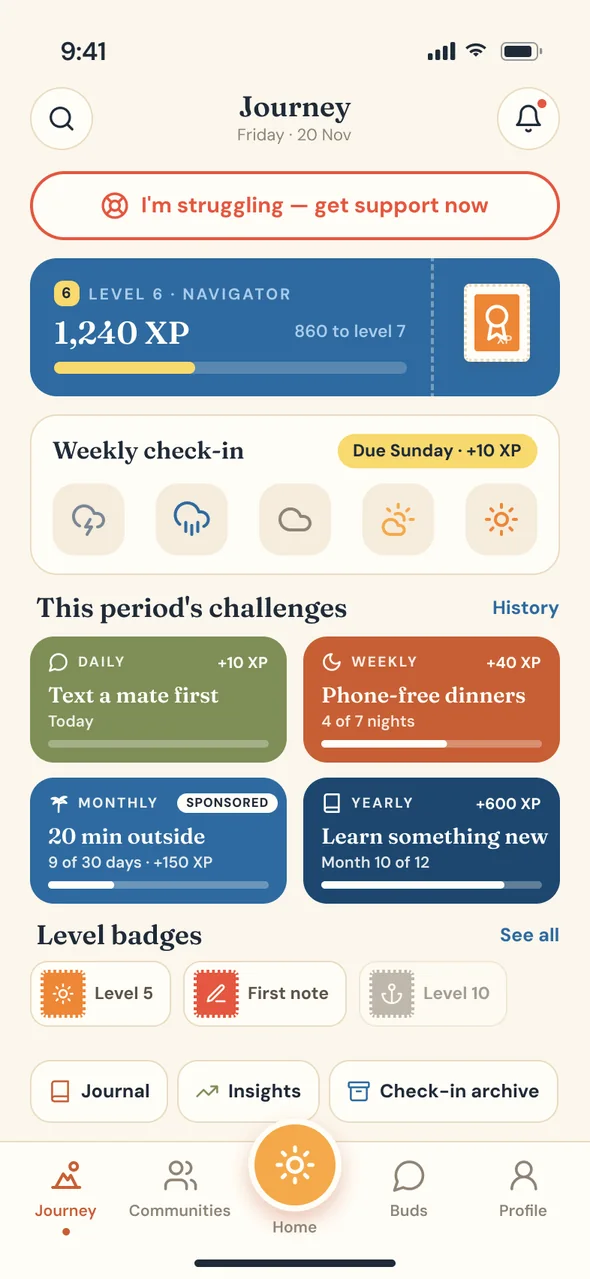
iOS / 18 Journey
Journey: XP, this period's challenges and postage-stamp badges
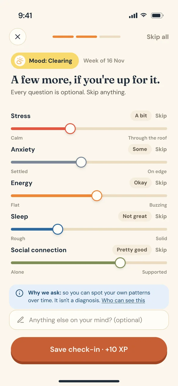
iOS / 20 Weekly check-in
The weekly check-in, with moods as weather
iOS / 22 Insights
Insights: a private chart of moods over time
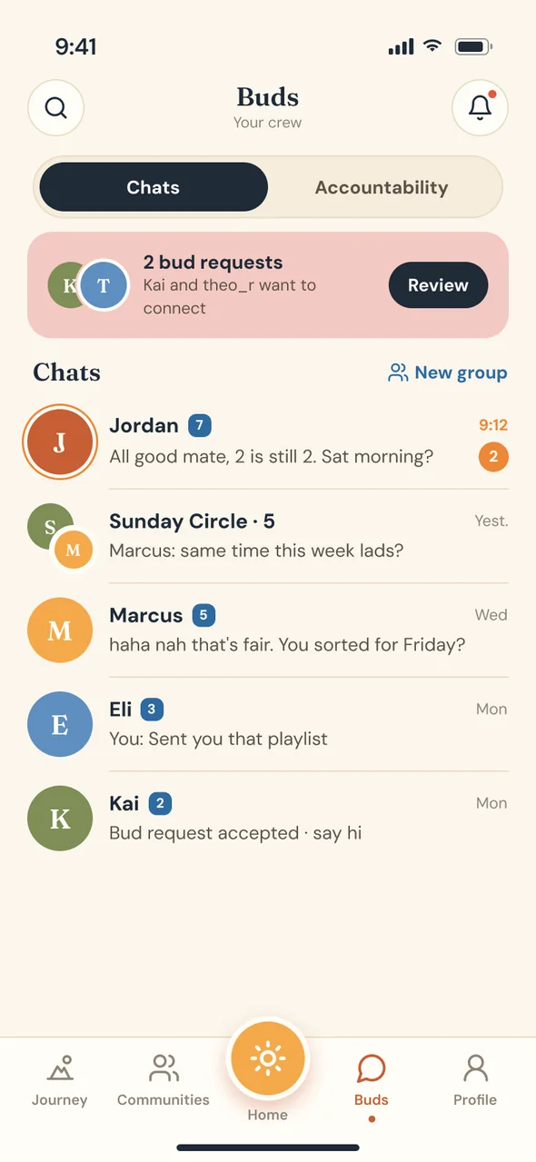
iOS / 26 Buds
Buds: chats with accountability partners
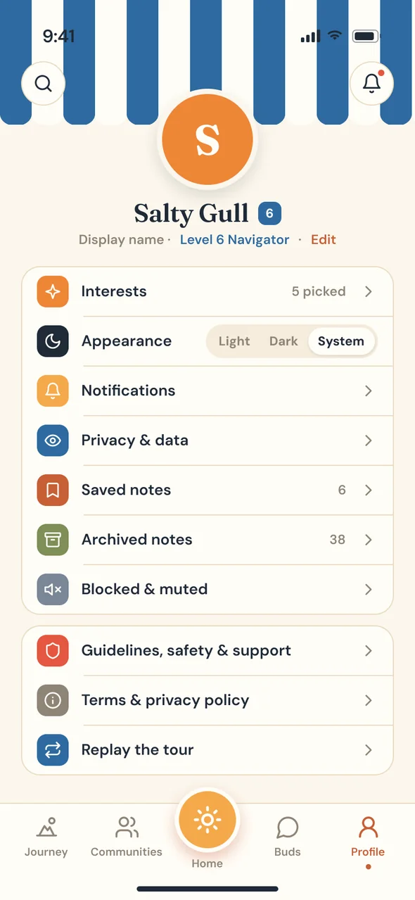
iOS / 31 Profile
The profile screen
Drag to see 12 of 31 screens
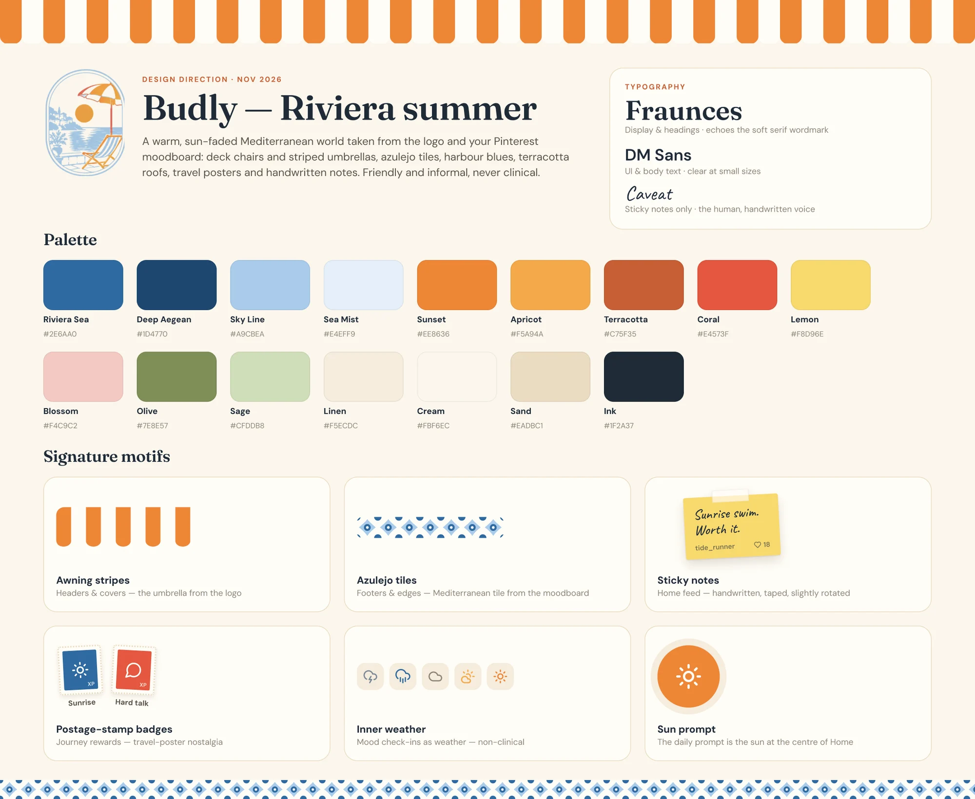
00 Design direction
Budly's design direction board: the Riviera summer palette, Fraunces and DM Sans type, and its motifs
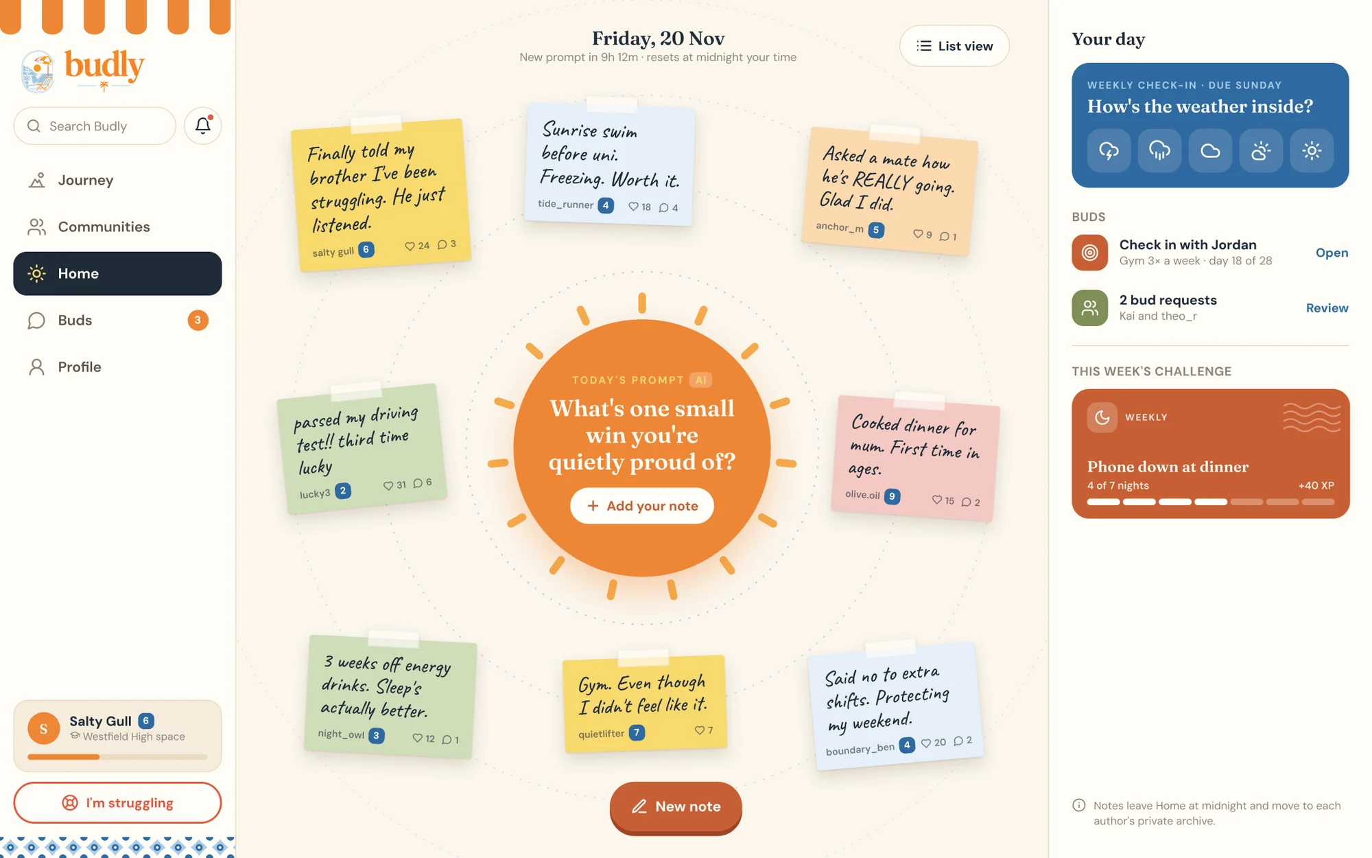
Web / D03 Home
Budly's web app home: a sidebar, sticky notes around the day's prompt and a panel with the week's check-in and challenge
Admin / A01 Overview
Budly's admin dashboard: user counts, daily active users, wellbeing trends, community members and items needing attention

A social app for young people to share honestly, find their people and get a little better, one day at a time. I set the visual direction, a warm “Riviera summer” of awning stripes, azulejo tiles and handwritten sticky notes, then designed the whole prototype in Figma: 31 iPhone screens from onboarding to journaling, a 7-screen web app and an admin dashboard with privacy-safe wellbeing trends and a moderation queue.
02 / 06App Store · 2026

ShepherdApp Store cover

Cover v2
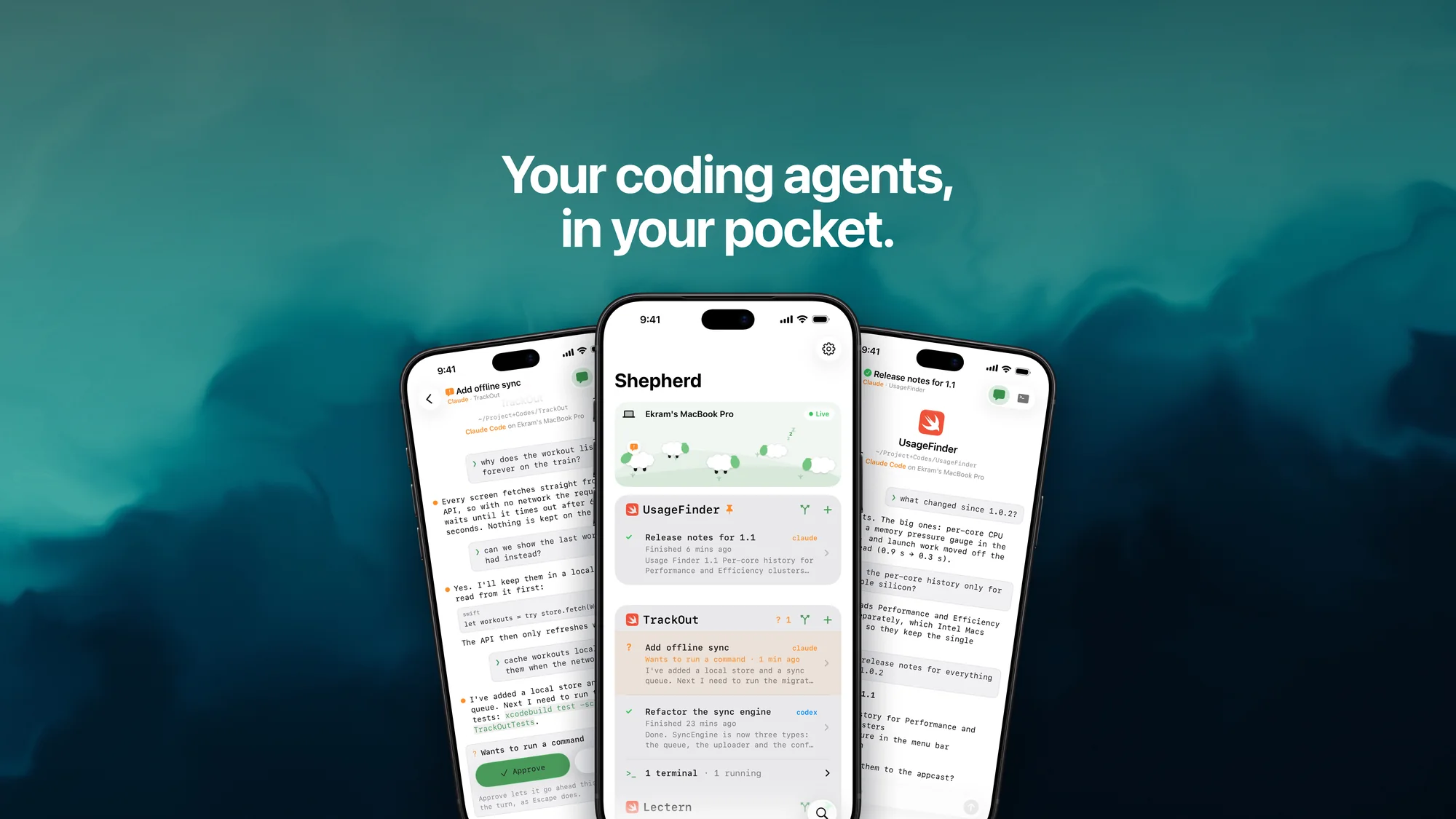
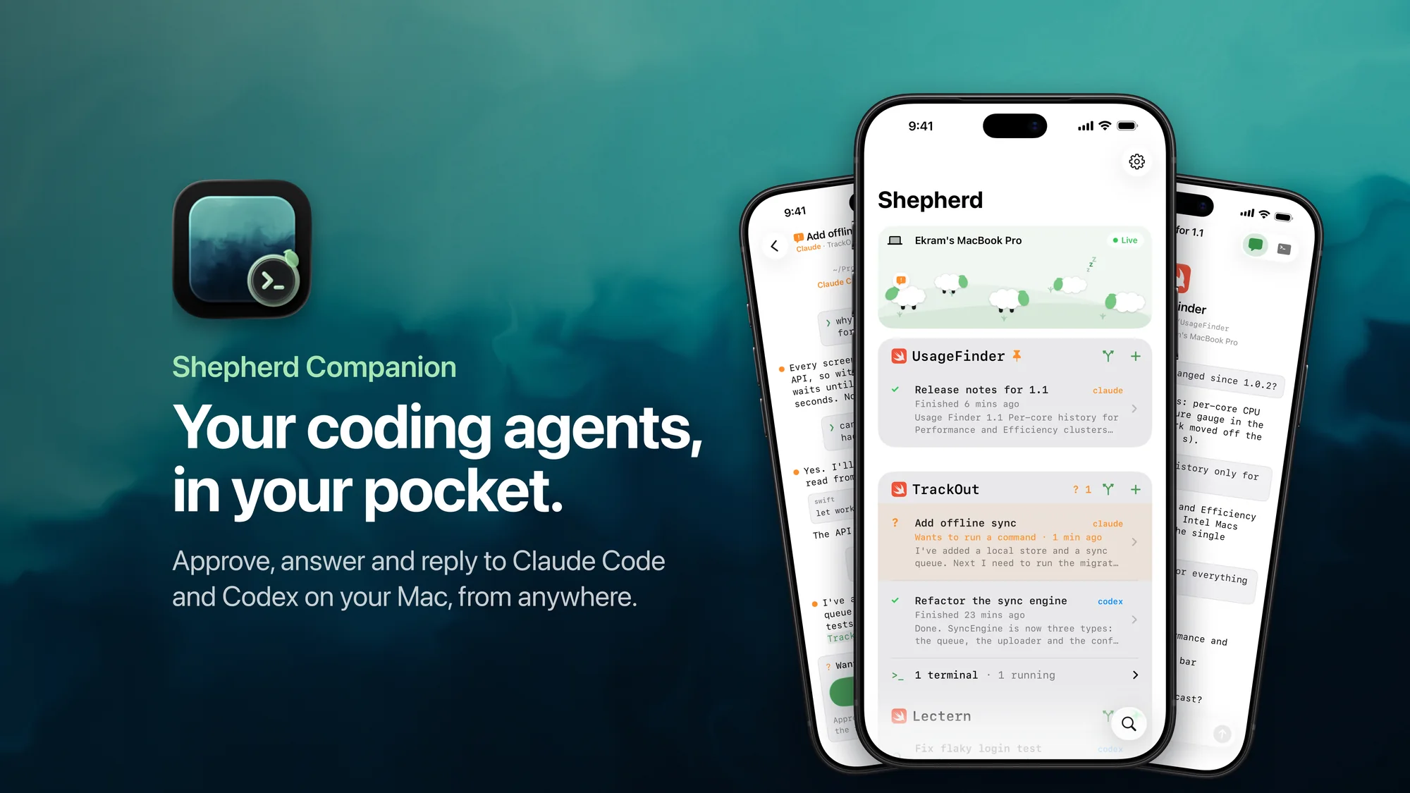
Shepherd Companion's App Store cover, version 2: the headline 'Your coding agents, in your pocket.' centred over three iPhones on a teal smoke wallpaper

Headline centred near the top, phones centred: everything fits both crops.

The product page header and search result artwork for Shepherd Companion: the Allegro Midnight wallpaper, a headline and three iPhones. The first version lost its icon and headline to the store's crops, so I measured where the App Store cuts the image on the product page and in search, then rebuilt the layout so everything important sits inside both. Switch versions and crops to see it.

03 / 06Design system · 2026

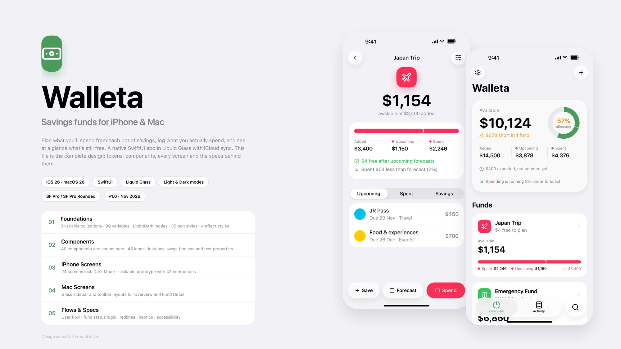
WalletaDesign system and app

Cover
Walleta's cover: the app's name and description beside two iPhone screens showing a savings fund and the overview
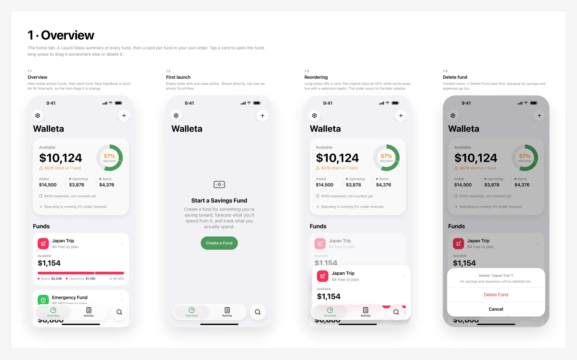
1 · Overview
Four iPhone screens of Walleta's overview: the funds list, first launch, reordering and deleting a fund
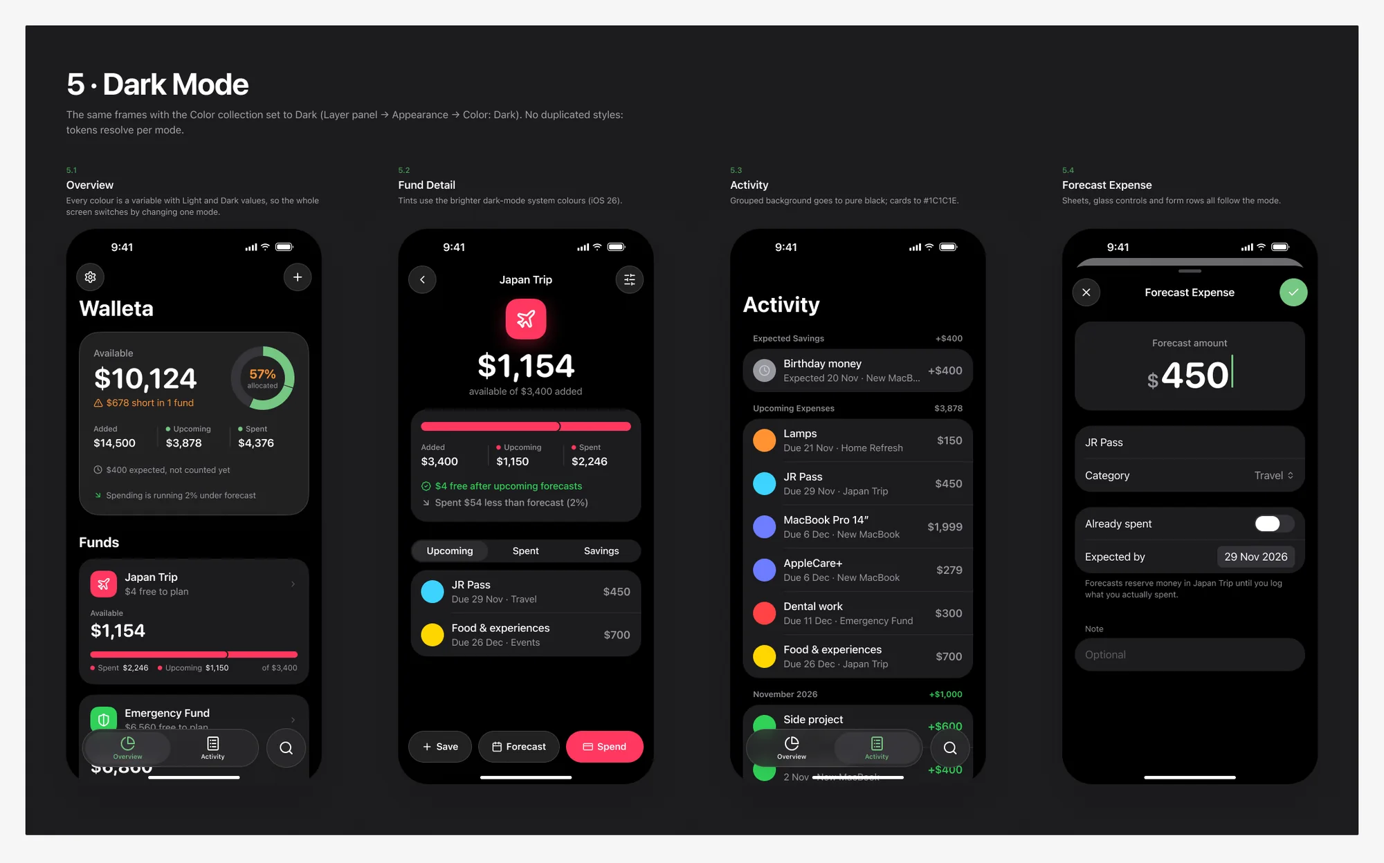
5 · Dark Mode
Walleta in dark mode: overview, a fund's detail, activity and forecasting an expense
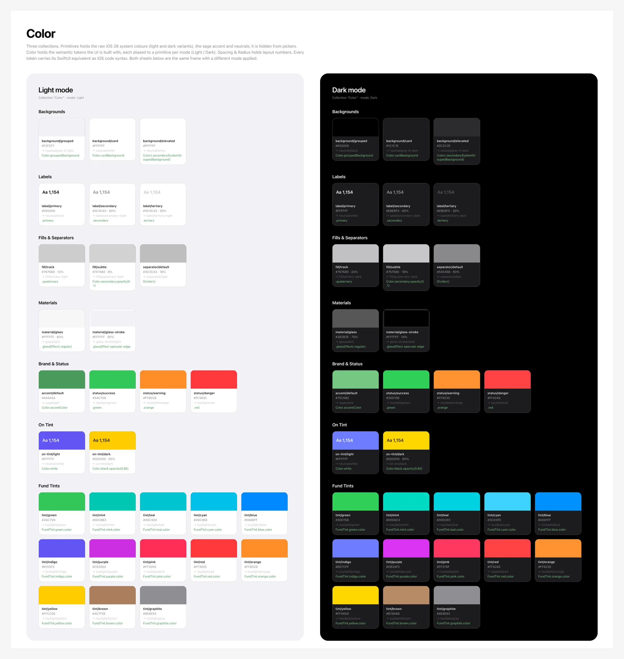
01 · Color
Walleta's colour foundations: backgrounds, labels, fills, materials, brand and fund tints in light and dark modes
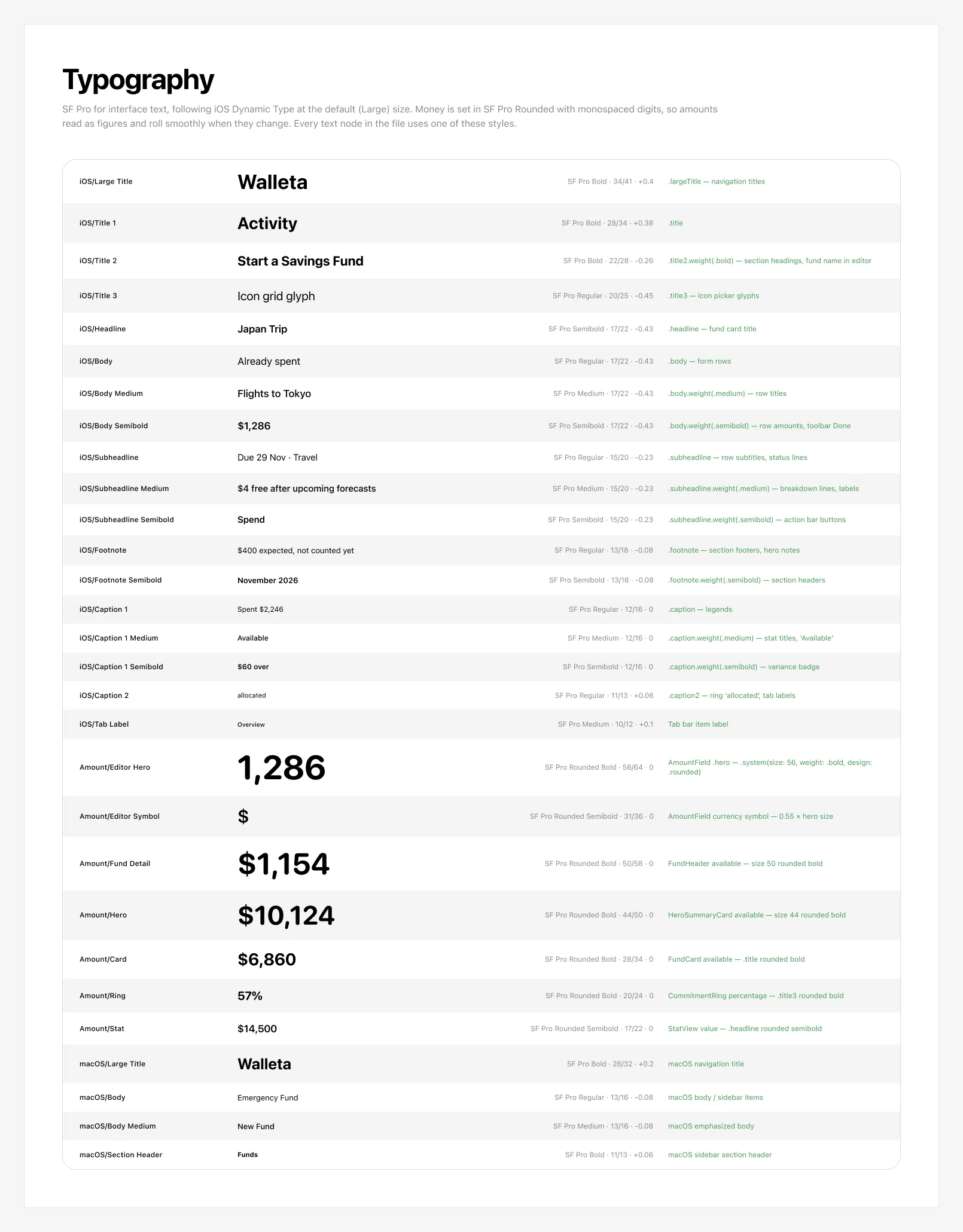
01 · Typography
Walleta's typography: the iOS and macOS text styles and the rounded figures for money
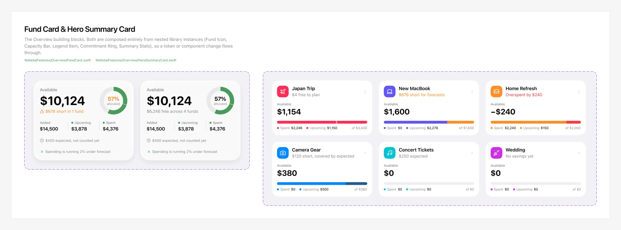
02 · Fund Card & Hero Summary Card
The Fund Card and Hero Summary Card components with their variants
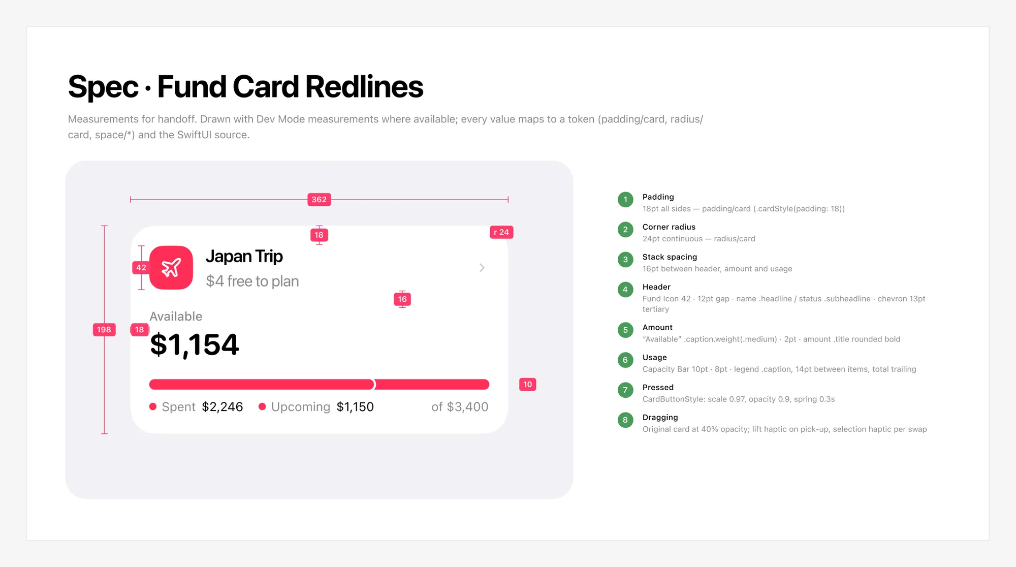
Spec · Fund Card Redlines
Redlines for the fund card: padding, corner radius, spacing and type, each mapped to a token
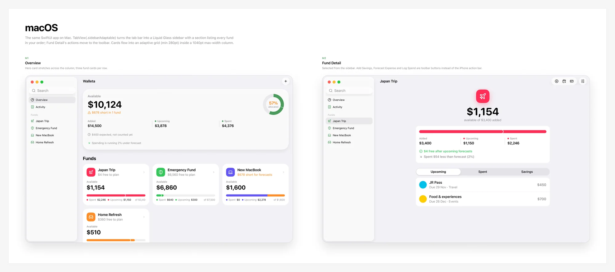
04 · Mac
Walleta on the Mac: the overview and a fund's detail with a glass sidebar

Savings funds for iPhone and Mac: plan what you'll spend from each pot of savings, log what you actually spend, and see at a glance what's still free. I designed the whole system in Figma for a native SwiftUI app in Liquid Glass: 99 variables across three collections with light and dark modes, 35 text styles, 40 components and variant sets with 48 icons, 24 iPhone screens with a clickable prototype of 43 interactions, Mac layouts, and the specs behind them: fund status logic, redlines, haptics and accessibility.

04 / 06App icon · 2026

Usage FinderApp icon

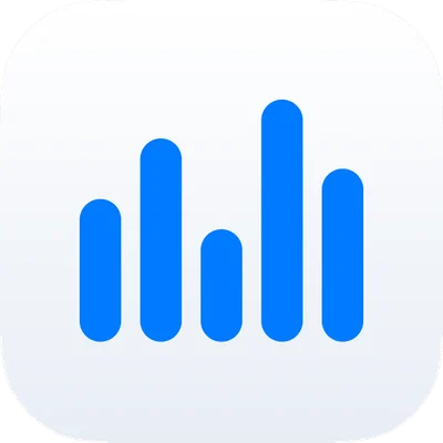
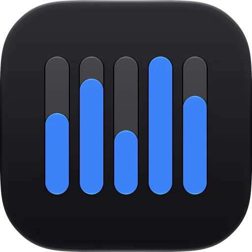
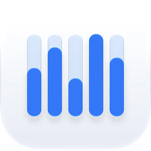
The finished Usage Finder icon in light mode: five blue bars over pale tracksFinal · Light

From a colourful first draft through a gauge to five bars of usage, each bar drawn over its own track. Every part is a separate layer, so Icon Composer could give each one its own depth and glass in light and dark.

05 / 06App icon · 2026

ShepherdApp icon

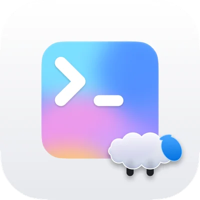
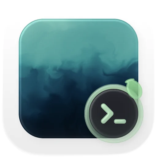
The finished Shepherd icon, Terminal Lens, in light modeFinal · Light

Three directions explored in Figma, from a glass lamb to a prompt on a dreamy screen, before Terminal Lens: a lens with a >_ over a screen of the Allegro wallpaper, the lamb peeking over its rim. I finished it in Icon Composer as a layered Liquid Glass icon with light and dark versions, and its lens became the app's menu bar mark, Live Activity glyph and widget icon.

06 / 06Wallpapers · 2026

AllegroWallpaper variants

Allegro · Original → Midnight Rich
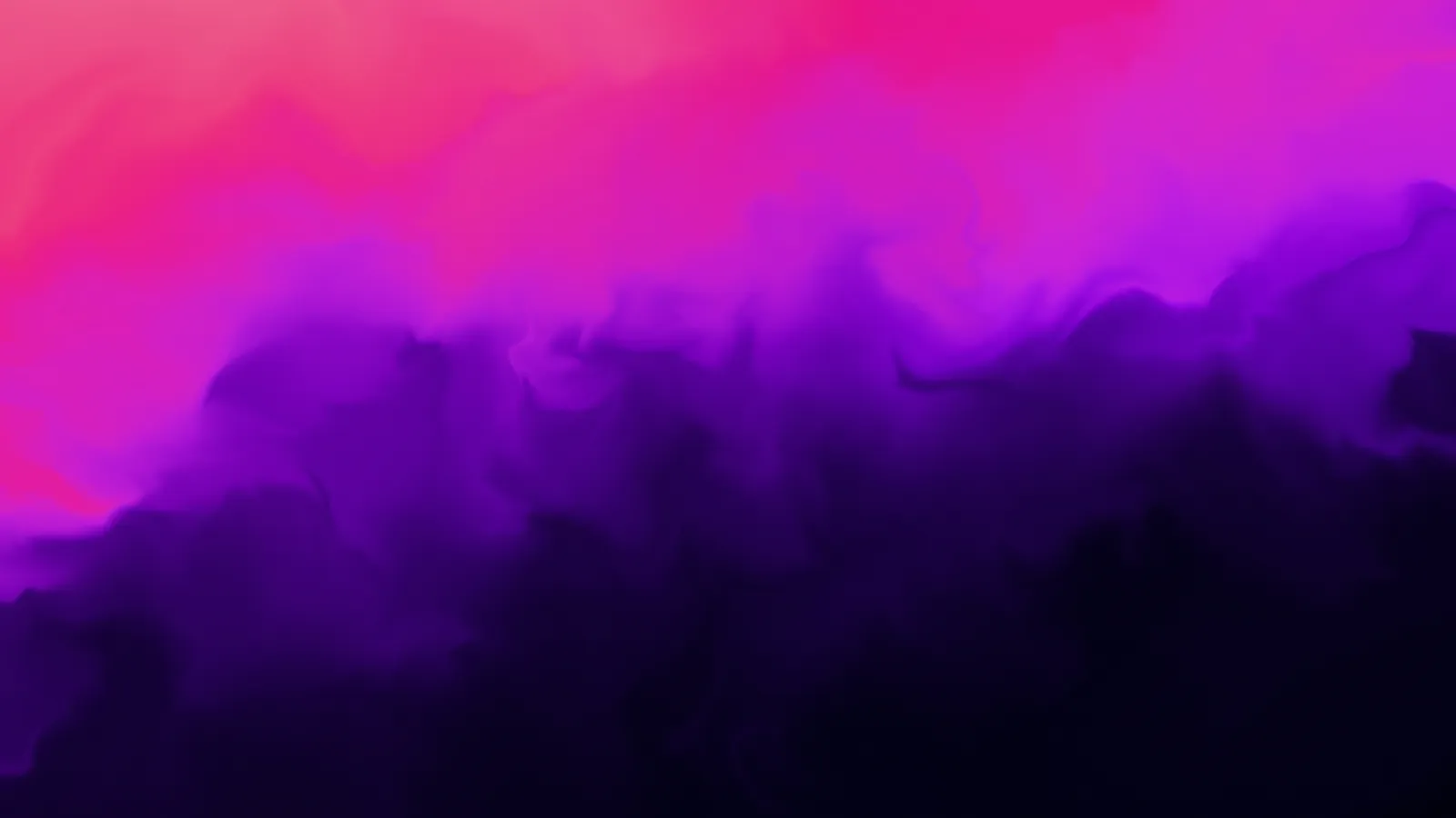
The original Allegro wallpaper: magenta and violet smokeThe Midnight Rich recolourOriginalMidnight Rich
Midnight · Saturated & Dock
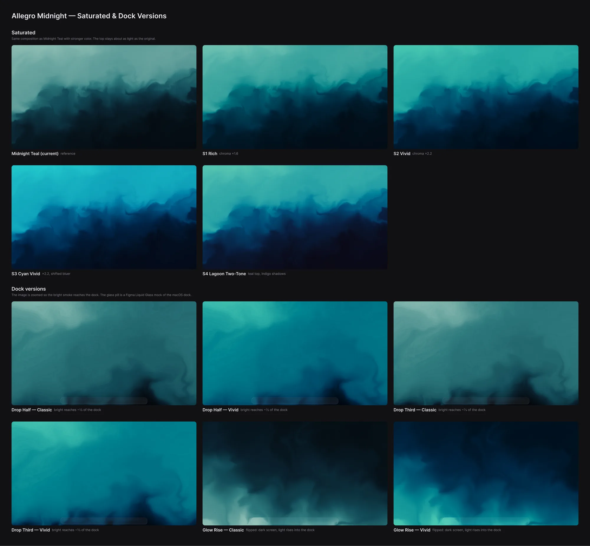
Saturated teal versions of the wallpaper and versions tuned so the bright smoke meets the macOS Dock
iPhone
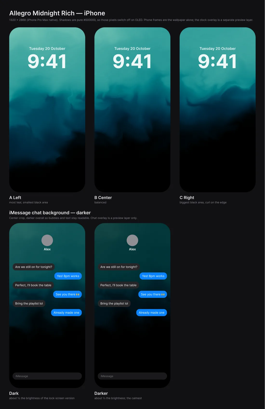
iPhone Lock Screen and Messages chat background versions of the Midnight wallpaper

The Allegro smoke wallpaper gradient-mapped into calmer palettes, then saturated and Dock-tuned versions of Midnight Teal for the Mac and Lock Screen and Messages versions for iPhone, all exportable at the full 6016 × 3384. Midnight Rich went on to become the screen in Shepherd's app icon and the backdrop of its App Store cover. Drag the handle to compare, and pick a palette: the page follows it.